Univers
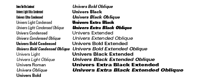
Univers is a realist sans-serif typeface designed by Adrian Frutiger in 1954. It is classed as a neo-grotesq typeface based on the 1898 typeface, Akzidenz-Grotesk. It is part of a group of sans-serif typefaces released in 1957 that includes Helvetica therefore sometimes the faces get confused with one another due to their predominant use in the Swiss Graphic Design style. Univers is a highly influential typeface and is one of the first to fulfil the idea they should form a family of consistent and familiar designs. These different variations are of weights and designated by the use of numbers rather than names- which is a system since adopted by Frutiger for other type designs. It currently has 44 faces with 16 uniquely numbered weight, width and position combinations. Univers is a typeface with many known uses for corporate branding, signage, maps and electronic devises. Apple used to use the font on the laptop keys before changing to VAG Rounded in 2007. It was also used for George W. Bush's campaign logos in 2000 and 2004.
Caslon
Caslon was designed in 1722 by William Caslon and was heavily used by the British empire in the early 18th century. The font is considered the first English typeface and from 1725 to 1730 there were 3 books printed by William Bower using roman and italic fonts cut by Caslon. The fonts were popular throughout the British Empire especially the American Colonies where they acquired their distinctive appearance from the exposure to salt air during the voyage from Britain. The use of the font decreased upon his death but was revived during the British Arts and Crafts movement of the 1840's to 80's. It is now considered the standard for typesetters and printers and is widely used. Caslon himself never designed a bold font but through the beginning of the 20th Century there has been 3 changes in the technology of typesetting that affected the Caslon font. Firstly the introduction of hot type and the development of photo setting in the 60's and 70's. This then developed to digital fonts that began in the 1980's. There have been many re-designs of the font, some far from the original. It has been used to set both the Declaration of Independence and the U.S. Constitution and the title font for the play Les Miserables.
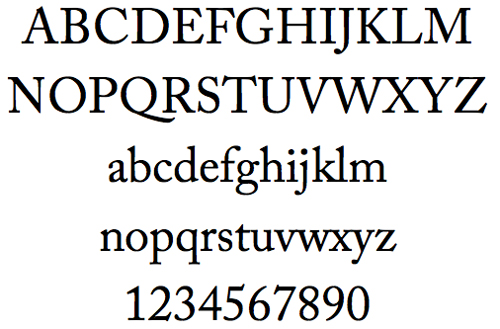
Baskerville

Baskerville was designed in 1754 by John Baskerville and is mostly known for its crisp edges, high contrast and generous proportions. Baskerville was illiterate but his interest in calligraphy and practised handwriting inspired him to learn how to read and write, these interests are evident in the strokes and embellishments within his printed typeface. The font is classes as a transitional typeface in-between classical typefaces and the high contrast modern typefaces. Baskerville developed his own method of working which resulted in woven paper and darker inks, creating an intense black ink colour through boiling fine linseed oil to a certain thickness. Baskerville would follow other printers closely which resulted in the highest standards for presses altogether. The font had little success during his life but his widow sold the Baskerville punches and matrixes to France where it circulated among foundries. American typographer, Bruce Rogers discovered a Baskerville type specimen in a Cambridge bookstore in 1917 and the type was revived in the 20th Century when he became a printing adviser to Harvard University Press. The font is an elegant book face and it can excel in purely typographic compositions and today remains one of the most popular and classic typefaces for print due to its legibility and refined beauty.
Clarendon
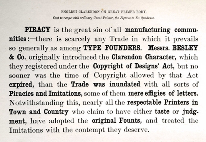
Clarendon was created in 1845 by Robert Besley for the Fann Street Foundary- it is named after Oxford's Clarendon Press and is a popular slab-serif. The letterforms represented a significant change from the slab-serif Antiques and Egyptians that were so popular in that time. The typeface became popular which lead Besley to register the design under Britain's Ornamental Designs Act of 1842 but the patent expired 3 years later and many competing foundries quickly copied its design once the hold was released.
 |
| Besley's reaction |
Berthold
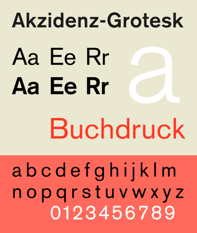
The H. Berthold typefoundry was created in 1858 by Hermann Berthold. It was renowned for crafting high-quality typefaces and by 1918 the foundary had become the largest in the world. After World War II, Berthold developed his own typesetting equipment and in the 1950's he unveiled his first phototypesetting machine, the 'Diatype'. He then introduced the 'Diatronic' in the 60's, this was the first keyboard controlled phototypesetting for volume production. During the 20th Century, the typefoundry developed the Berthold Exklusiv Collection- a collection of typefaces created solely for Berthold by distinguished designers. The foundry's most celebrated typeface family is Akzidenz- Grotesk, created in 1896- it is an early sans-serif which prefigured by half a century the release of popular neo-grotesque typefaces like Helvetica. In 1950, type designer Gunter Gerhard Lange became part of the company and he designed various original typefaces like Concorde and Imago. He also oversaw the foundry's revivals of classic faces such as Garamond, Caslon, Baskerville and Bodoni.
No comments:
Post a Comment