- Helvetica was created in 1957 during the emergence of Swiss style in the 1950's. There was a feeling of idealism that design is partial to rebuild and be more democratic. This means it has a sense of social mobility giving it power and hierarchy above other typefaces. Helvetica is clear, readable and straightforward therefore it became incredibly popular for signs and corporate systems, it is even used for the IRS tax forms.
- Massimo Vignelli created New York City's transit signage. He has an extremely positive view on the typeface and believes type should not be expressive because without helvetica we are surrounded by "visual disease." He says type is like music, it is not about the notes but more about the spacing in the notes.
- Although Helvetica is such a popular typeface, not everyone agrees that it should be used. Erik Spiekerman states that real type needs rhythm and contrast, however Helvetica does not. He says it is a default font that is never going to go away which means it becomes repetitive and boring. He says helvetica has a human like quality to it which is positive in communicating to the wider audience yet not to Spiekerman as he thinks the aim of type design is to look familiar.
- Design writer, Rick Poynor calls helvetica the law of diminishing returns, meaning the more the public see it then the more the designer uses it. This ultimately makes the typeface incredibly familiar and predictable. By the 70's there was a huge reaction against the conformity of the "dull blanket of same-ism" that helvetica created. This specific way of design is imposing on the world and something that came out of idealism by this time became routine and there was a huge need for change.
- Despite the split views of helvetica, it is universal which means it is used everywhere. It is the ultimate typeface because it is available in so many platforms, giving it a feeling of finality, it is the typeface that says everything yet why is it so popular? The fact it is everywhere makes it arguably the "safe" option.
| American Airlines logo |
| American Apparel logo |
The American Apparel logo is arguably very similar to the American Airlines logo, despite the fact they are both in Helvetica font the kerning is also very similar, the American Apparel logo is slightly closer together and there is a bigger gap between the two words. Therefore, there is a lot more negative space around the logo meaning white is a very predominant colour as well as the bold black font giving a high impact when the logo is placed into context. I do not find this logo very engaging, however the simple no fuss means it has become instantly recognisable and iconic, the close kerning on the logo means it can be easily applied in context to numerous platforms and it still work just as well.
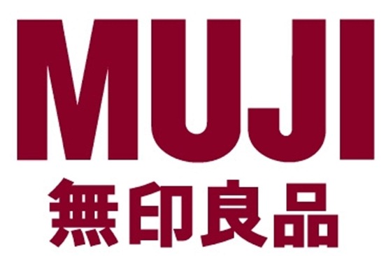 |
| Muji logo |
The Muji logo is a bit more different to the other two logos, they are different to many other logos because it is distinguished by its design minimalism and no logo or brand policy. This reflects through its logo as they have chosen to use helvetica as their typeface, helvetica can be viewed as a minimalistic font which is what the company is recognised by. They do not put much money into their branding and designing so they intend for their logo to be simple which allows more emphasis on the brand itself and I think that is what the designer of the logo is trying to communicate. The designer has approached the design of the logo in this way to reflect the brands identity and not draw away from what they believe in.
No comments:
Post a Comment