 |
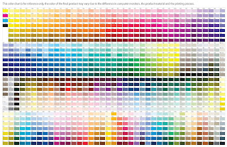
| Pantone colour swatches |
Online I came across this huge Pantone colour chart with so many colour options available, I then took this into Photoshop and picked out some of my favourites in order to gather around 5 colours that I will use throughout the design of the app.
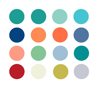 |
| Colour options |
These above are the colour options I am really keen on, as a whole I think they all go well together but I definitely want to choose 4 to have as my main colours for the app. Its important to keep the colours quite neutral so the app doesn't become too busy and ugly for the user but also keep them bright at the same time because it will attract them to download the app.
Within all the options above I was playing around with what colours best suited each other and what colour pallet worked well together.
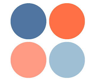 |
| Final colour swatches |
These are the final 4 colours I want to use for the app design, I think they compliment each other really well and will help the app to be appealing to the audience. I have no doubt that the app will probably have a lot of white in it swell, as from just experimenting previously with coloured backgrounds I did not like them at all.


No comments:
Post a Comment