 |
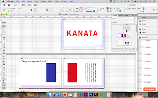
| Figure 1 |
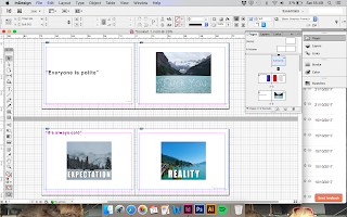 |
| Figure 2 |
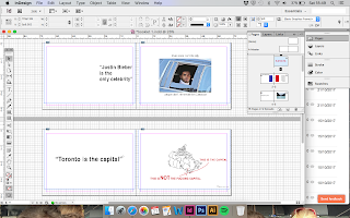 |
| Figure 3 |
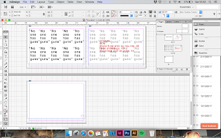 |
| Figure 4 |
Figures 1-4 show the publication placed in InDesign ready to send to print, before printing this in the digital print room, I created a mock up by just printing from the computer room. Within InDesign I created a booklet so that when the publication was printed all I needed to do was chop it down to the correct size as the crop marks will be visible on the pages.
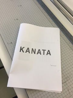 |
| Figure 5 |
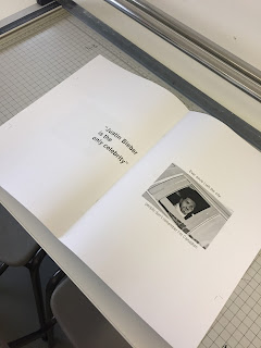 |
| Figure 6 |
When the publication was printed, this is what it turned out like, I had to print onto A3 paper in order for the correct sizing to be on the pages. The only fault I found when printing the mock up was that there were two blank pages at the end of the publication, this was because the pages needed to be in multiples of 4 in order for them to print correctly with no blank pages. At this point I am unsure what to create extra pages of so I am going to ask that in the final crit to get some other opinions on it.


No comments:
Post a Comment