The Brief
‘In a hundred ways Animal Farm triggers our modern intelligence and persists in its relevance, and its seemingly simple yet subtle fable still belongs to us as we try to find our way through the changing political and moral labyrinths of twentieth-century history.’ - Malcolm Bradbury
We are looking for a cover design which will reflect the book’s status as one of the great modern political allegories of our time, as relevant today as it was when it was first published over 50 years ago. It is rich with ideas, characters, allegory, political and moral philosophy – read it and decide for yourself how best to showcase the content of this remarkable novel through your cover design and bring it to a new generation of readers.
Your cover design needs to include all the cover copy supplied and be designed to the specified design template – B format, 198mm high x 129mm wide, spine width 8 mm, incorporating the Penguin branding and all additional elements such as the barcode. Please refer to the Submissions Details page for full details of the spec and how to submit your entry.
What the judges are looking for
We are looking for a striking cover design that is well executed, has an imaginative concept and clearly places the book for its market. While all elements of the jacket need to work together as a cohesive whole, remember that the front cover must be effective on its own and be eye-catching within a crowded bookshop setting. It also needs to be able to work on screen for digital retailers such as Amazon.
The winning design will need to:
- have an imaginative concept and original interpretation of the brief
- be competently executed with strong use of typography
- appeal to a contemporary readership
- show a good understanding of the marketplace
- have a point of difference from the many other book covers it is competing against
Copyright must be cleared for all images used in your cover design and you must include a credit line on the back cover of your design for any third party images used. For example: ‘Cover photograph by Joe Bloggs’.
EXISTING BOOK COVERS
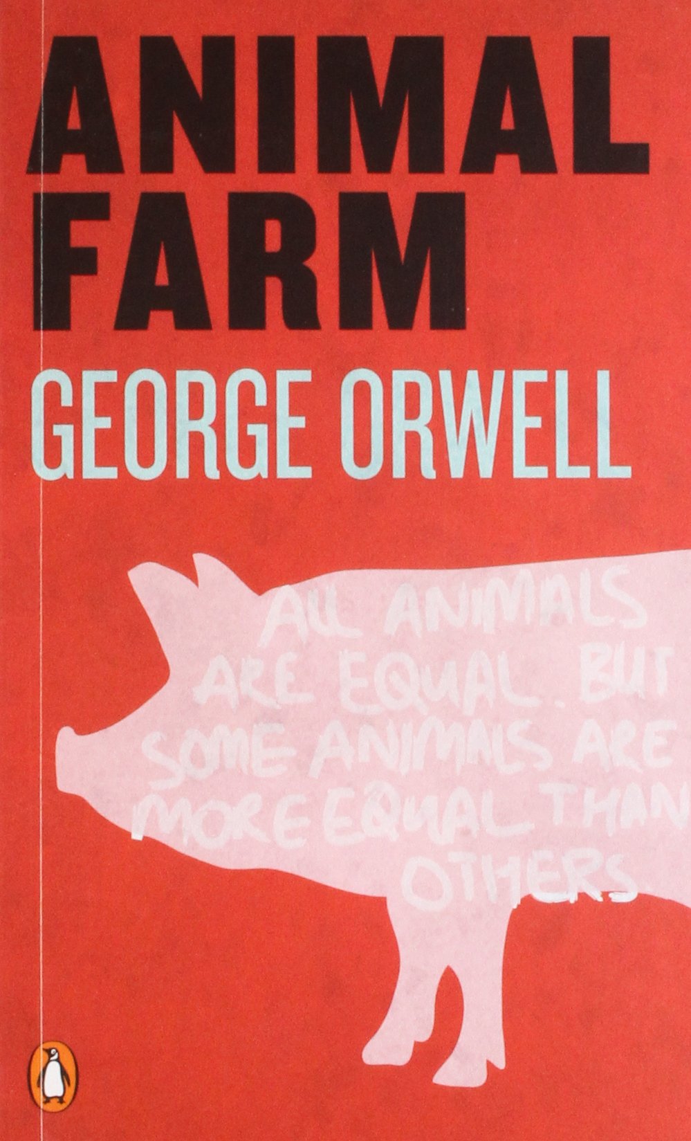
Regarding the existing book covers, despite them being different in terms of their illustrations, they all have some similarities.
The biggest stand out similarity is the book covers colour, red seems to be very consistent, most likely used to resemble the storyline. The image of the pig is also used on each of the book covers, again this is reflective of the story itself and the characters within the story.
The biggest stand out similarity is the book covers colour, red seems to be very consistent, most likely used to resemble the storyline. The image of the pig is also used on each of the book covers, again this is reflective of the story itself and the characters within the story.


No comments:
Post a Comment