Sunday, 26 November 2017

OUGD504- Module Evaluation

Design for print and screen have been two really interesting briefs, I feel like they have been incredibly open and free, allowing any kind of design to be used, this is something I really appreciate as I struggle a lot when the briefs are very limited. The completion of both of these briefs have been a difficult task, as I mentioned before in the studio brief 2 evaluation, I did benefit a great from the extra week I had to work on the module as I would of not had as much work to submit compared to what I do now. I am comfortable in saying this module has not been completed to my greatest ability and I am not expecting a very good mark back. However, I am working on myself and I do hope now I have the right support and mind-set in order to complete the rest of the studio brief modules throughout the year.


Out of the two briefs within this module, I have enjoyed brief 2 a lot more, this is because I was able to complete the work using my own idea and not someone else’s. I do think my publication is quite week, I found I became really disinterested in completing this brief as I did find the content quite dry in terms of what I would usually be interested in myself. I think the outcome would have been a lot better if I were completing my own idea, over summer I became very excited to begin working on this publication because I was really interested in what I was going to produce. In terms of working alongside another peer, I did find it quite difficult to start with because the initial idea kept changing so I could have been working on the layout and design at a much earlier stage to what I actually did. Having talks from visiting speakers like GF Smith were incredibly interesting because publication design has always been something I have had a keen interest in so it was nice to see what real designers worked on. In addition, studio brief 2 also provided itself with some challenges, I did find myself getting confused when it came to creating the app, I was keen to use Adobe XD because its something I have never used before but sadly I just did not have the time but its definitely something I would explore in other briefs.

OUGD504- Design for screen evaluation


Design for screen has been a lot more enjoyable than the previous brief. Although it’s fair to say I have struggles with completing both of these briefs in the given time frame and they are nowhere near to the best of my abilities. I think the second brief has been a lot more enjoyable because I was able to work with my own idea, unlike the previous. Creating an app has been something that I have not yet had an opportunity to complete so I have has the opportunity to learn a lot about what goes into designing for screen. There have been many seminars on this particular brief, filled with content I was not aware of, therefore providing me with an opportunity to learn. Before this brief I was not aware of what ‘user experience’ was, now I feel I have a good understanding of this and feel it will be important to consider with a lot of other briefs I will likely complete throughout the year. The talks from visiting speakers have been incredibly interesting and I have also learnt a lot from these, it has been really interesting to see what kind of work people complete within their own studios, I think this is a really important part of level 5 as it provides us with an opportunity to really gain knowledge of this and know what to do beyond university. When it came to designing the app, I think this is where you can begin to see my real struggle. I spent a lot of time working out what to include within it and really understanding aspects like wireframes and the user experience, however I don’t think my knowledge of this is reflected within the app design. Although my week extension did help an incredible amount with what I was able to complete, I have found completing work a really struggle and I am disappointed that this shows within my final outcome.

OUGD504- App Mock-up


These are the final screens for my app design, I have mocked them up on a blank iPhone screen so it gives more of a realistic effect. I think they look a lot better like this because it gives more of an idea of what the app will really look like. The colours all work well together and each screen is legible to the user. It would of been easy for me to keep the screens all one colour, I wasn't going to do this because I feel like it would make the app incredibly boring so I feel like it has worked well. 

OUGD504- App screens


These are the opening screens the user will go through before entering the app, if the user is simply logging in then they will be directly taken to the bottom left image where they can select what part of the app they are going to be needing. If the user is using the app for the first time they are given the option to sign-up, this will then lead them to only another 3 screens before reaching the final one. I have kept this to a minimum because a lot of apps when completing my research took a while before you got fully into it and made me bored straight away- this way this is avoided. I have decided to include a small summary about the app and what the user can expect from it, this leads on to a screen where the user can select any dietary requirements so these recipes will not appear while using the app, or recipes with an alternative may be advised.

Tapping on shopping list will take you to the image on the right, a place where students can add in any bits of food they may want to pick up throughout the week or at the end of the week. On the left, you will be taken to that screen if you tap on meal planner, it gives you 7 places to put in what you are going to eat on each day of the week- it will give you an option on a recipe to add this to one of the days of the week so the user can access it efficiently. 


These are the screens that show the steps to get to finding your recipe, again I have kept the screens to a minimum so the user doesn't have to take ages tapping through each step.


OUGD504- App Store Logo


Different colour variations exploring what the app logo will look like in the app store, I have decided to keep it simple and just use the name of the app, I think this will work well because the name is really catchy and will instantly draw people to it.

I chose to go with this colour combination just because it appeared to be the most legible so users shouldn't have any difficult in reading this.

Saturday, 25 November 2017

OUGD504- App Logo

THE HUNGRY STUDENT

Font options:


Logo name in various fonts
Chosen font Verdana
I have chosen to go with Verdana as the font to use on my app because the sans serif letters make it incredibly legible for the user, this is important for an app because you are reading something from a phone- a lot smaller than from a computer or laptop screen. Within the image above, I have taken the font into InDesign to experiment with the kerning, something that may have to be explored when the app is being designed. 


This is the chosen font applied to the 4 colours I am going to use throughout the app, I think these colours will work well together and the contrast of regular vs bold doesn't clash at all. 


OUGD504- App Name

This is a step I almost forgot to do as I didn't really think about the fact my app will need a name in order to be searched within the app store. Along with having a name, it will also need a small logo that will appear as its icon in the app store, I aim to keep this very simple and the name quite short and catchy.

Name Ideas:

Student meals
Meals for student
The hungry student
A hungry student
Hungry student


(I thinking keeping student in the name of the app will be really beneficial because they can instantly know its targeted at them and expect it to be filled with accessible meals and recipe ideas compared to the apps already on the market)

THE HUNGRY STUDENT

-catchy
-to the point of the app
-quite humorous 
-simple
-memorable


OUGD504- Colour Experimentation

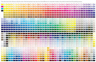
Pantone colour swatches
Online I came across this huge Pantone colour chart with so many colour options available, I then took this into Photoshop and picked out some of my favourites in order to gather around 5 colours that I will use throughout the design of the app. 

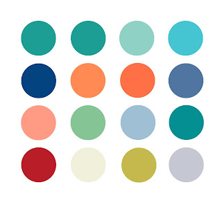
Colour options
These above are the colour options I am really keen on, as a whole I think they all go well together but I definitely want to choose 4 to have as my main colours for the app. Its important to keep the colours quite neutral so the app doesn't become too busy and ugly for the user but also keep them bright at the same time because it will attract them to download the app.


Within all the options above I was playing around with what colours best suited each other and what colour pallet worked well together. 

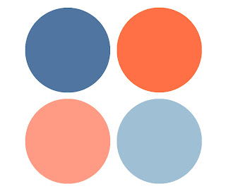
Final colour swatches
These are the final 4 colours I want to use for the app design, I think they compliment each other really well and will help the app to be appealing to the audience. I have no doubt that the app will probably have a lot of white in it swell, as from just experimenting previously with coloured backgrounds I did not like them at all.


OUGD504- Wireframe sketches


These are simple wireframe sketches of the app, showing the ways it could be laid out and the content included within each screen. It has been useful to create these sketches because it means I can begin to digitally design the app with more of a solid idea in my mind to what it would look like.

Tuesday, 14 November 2017

OUGD504- Initial Designs


These are going to be the first screens that appear when the app is opened. I think the first one should be the one with the various options to either cook/shop/meal plan, rather than going straight into the cooking side of the app as the user might not want to do this every time the app is opened. 


These are the initial colours I have chosen to go with so far, however I am not convinced at all that these work. The contrast of the two clash and I personally think it looks quite harsh whereas I intend the app to very welcoming and student friendly. My next step is going to be creating a few colour swatches and seeing which work the best next to one another.


OUGD504- Learning Outcomes

5A5 Aware of information, content, how that influences design decisions, how content and users have changed/informed direction Media chosen ,why is it relevant. App/web/audio/visual, what kind of media is it going to be communicated on, and what are the relevant decisions and things to consider in relation to the media Format, how it’s distributed delivered. Context, what situation it will be consumed in , what aspects of social life it relates to. 5A6 limitations and potential of different production processes stock, etc. (the limitations of the zine and the production of this). Screen based design, relationship with developers. Evaluation, explicit, evaluating in terms it’s potential within the industry. 5B4 Extent of research, research into content. Research into why it is needed, what purpose it fulfils. Practical research - binding/print techniques, finishing etc. Software skills, photoshop animation, analysed and critically evaluated. (an amount of detail and consideration of impact and how it relates to you now and in the future). 5C4 Do the work, use appropriate technologies and appropriate media. Establish why. Justify design decisions. 5C5 Justify design decisions. Technically competent, work that is good, appropriate and it works. App design, demonstrating, the structure, design layout and colours and that these are appropriate and these skills are competent. 5D4 Documenting processes, blog etc. Studio Brief 01 - Design for Print 5-6 design boards (documenting and summarising, concise, design decisions, process, research etc.) Studio Practice Blog PDF Finished Publication Evaluation (any complications/cutting corners/ making allowances, access to technology/materials, be explicit about these in evaluation, also on design boards). Studio brief 02 - Design for Screen 5-6 Design Boards - (Final design board, visual representation of design, explains what design looks like). Studio Practice Blog PDF - Including any moving visual presentations of your design. Evaluation Summative Module Evaluation Blog All posts relating to this module must be labelled ‘OUGD504’. All posts must have a visible date and time. Submission Details Blog must be saved as a PDF and uploaded to dropbox. Submit work in an A3 submission file. Include module submission label - available on e-studio 20th November 10:00 - 12:00 Room 118

Monday, 6 November 2017

OUGD504- What is a wireframe?

A Wireframe is a low-fidelity simplified outline of your product, you can usually recognise them by their distinctive block layouts, use of lines and to represent text, and 'x' squares indicating placeholders for future images.

Wireframes= the skeleton, they loosely shape the final product giving you an idea of where they will eventually go

Mockup= the skin, they are strictly visual and this is the documentation where you solidify your final decisions.

Prototype=they test your interface ideas and generate the feedback necessary to keep the design headed in the right direction.

Sketch => Wireframe => Lo-fi Prototype => Hi-fi Mockup => Hi-fi Prototype (Rapid) => Code


Wireframe => Lo-fi Prototype => Hi-fi- Mockup => Code

Why are they useful?

  • Giving visual designers a basis to begin creating screens
  • Using as a reference point for functional specifications
  • Communicating the functionality you are going to build with stakeholders without muddying the waters with visual design elements or branding
  • Exploring ideas without the difficulty of change inherent in Photoshop mockups
  • Using as a basis for prototyping and for user testing ideas early on

OUGD504- Smart Style Guides

Article from STUDIO by UXPin 'Great UI Design Requires Smart Style Guides'

"A style guide is a comprehensive 'living document' that keeps track of all the repeating elements for a project, from branding rules down to the amount of bevelling for call-to-action buttons. They should also impart rules and suggest practices including do's and don'ts. They're also a great place to define the design philosophy for a company."

  • Visual consistency – As explained in Web UI Design Practices, style guides help you create a cohesive design that reflects a common visual language. Elements like color palettes, typefaces, animations, and navigation menus all contribute towards a unified user experience.
  • Context – Great style guides account for explaining the reasoning behind design decisions. For example, in addition to explaining the technical details for pages with scrolling navigation and those with tab navigation, you should also explain that scrolling are used for storytelling, while tabs are used for product displays.
  • Collaboration – Having a set reference manual for each member of the team will ensure that everyone’s on the same page. Collaboration is easier, with less repeated questions and back-and-forth emailing.
  • Singular vocabulary — Another collaborative trait is streamlining communication through a singular vocabulary (i.e., defining what a “widget” or a “module” might be). Nailing down proper naming conventions can spare a lot of unnecessary miscommunication.
  • Code standardization – Front-end style guides help standardize the (X)HTML, CSS, or Javascript, so designers and developers can see if a new design deviates from established standards. They also help you discover if existing markup easily expanded.
  • Consolidation – Designers only need to look one place to reference all components, as opposed to losing time sifting through different notes and questioning which documents say what.
  • New employee orientation – Rather than repeatedly teaching new hires the standards, you can send them a style guide for reference as they ramp up. With the style guide as an anchoring document, follow-up conversations will be more meaningful.
  • Helps with design decisions — Don’t overlook that the process of making the style guide can draw your attention to some crucial design decisions that you may have otherwise forgotten.
Examples of successful style guides:

It systematically lists out black-and-white details with the corresponding HTML coding, it outlines all the information you need.

Lonely Planet 
Lonely Planet style guide


OUGD504- Creating an App

An app is something I have never created or designed before so I think its important to do as much research possible and to take advantage of any resources and articles provided by tutors in order to get the best possible result out of my work.

Reading an article from proto.io called 'The 10 Commandments of Mobile App Design' it has enabled me to carefully consider all the components of what needs to go into creating a successful app.

Don't overcomplicate things 
Limit feature to what are necessary and ensure your user interaction reflects something similar, you should do exactly what the user needs.

Ensure your design is accessible

Test your app on both Android and iOS, it needs to reach a wide audience of users. 

Don't reinvent something already out there
Don't throw away convention just to make you app different from everyone else out there, ensure you work with your users familiar design language- if you decide to add new elements make sure they work and not just for the sake of making your app seem different, ensure it adds something to the app experience.

Always remember who you are designing for
Every audience will have different expectations and needs for an app and they will each be responsive to different types of designs.

Don't use obnoxious fonts 
It's just as important to use suitable fonts on an app than a website etc.. They are crucial to user experience so you need to ensure the font is readable and fits the design.

Stay consistent  
Stick with similar design choices throughout the app, it needs to be unified or it will make the user feel uncomfortable and confused. If the app is being designed for a particular company or industry then it should match their style.

Keep mobile in mind 
Although phone devises have got larger to make it easier for users to navigate around, they may still expect to have a one-handed usability. The environment in which the app is going to be used in will also need to be considered, the user interaction needs to be clean and uncluttered so users can find the function they need.

Remember user flow 

  • Consider these basic questions: 
  • What purpose does your app serve for the user?
  • How will they navigate through it to get to the functions they need?
  • How many pages will they have to parse?
  • How many menu clicks will it take to access a certain button?
  • Which functions need to be the most accessible?

Create a realistic prototype 
Creating sketches will only get you so far, an interactive, realistic prototype can make your client much more excited about the app.

Test and test again
Testing is crucial to user experience, even if the app doesn't have a fatal flaw, users will be picky and one small thing would make them delete the app.


OUGD504- Defining the brief

-App for students
-Recipe app
-Easy, medium and hard options
-Option to add a shopping list
-Option to plan meals for a week