Sunday, 27 November 2016

STUDY TASK 02

Study task 2 was intending for us to experiment with various materials to produce outcomes and interpretations of our chosen word. The word I chose to experiment with was ‘obscure’, I thought this would be an interesting word to produce outcomes for, signs and symbols are made to be universal and understood by everyone, they are not designed to be obscure. This means I can challenge the perception and understanding of signs, pushing the boundaries of Frutiger’s comments on the basic signs and symbols. 


Taking the experiments I thought were the most developed and interesting, I scanned them in order for them to be developed digitally and to be turned into developed outcomes. The black circle and square would make a very obscure sign or symbol to be used around Leeds city centre, the fact the square is mostly negative black space will make the audience question what it is for, immediately it would not be directly associated with anything. Trying these designs within other shapes for me, instantly takes away the idea of the signs being obscure, by having arrows it gives the signs and symbols a purpose, to direct. This would be beneficial if they were to be used practically and with a true intention, the designs in the arrows pointing left and right respond to Frutiger’s ideologies about arrows, as he says the ones pointing left and right will be given more attention by the public.


These are the designs placed upon Oti Aicher's grid. 

STUDY TASK 01

Task 1:

Create a 2 minute long video using only signs and symbols to create a diversion.

https://vimeo.com/192999993

In our group video, we wanted to test if people would react to something being randomly placed on to the floor, to do this we used tape and created a hopscotch in the hope it would be interacted with. As you can see from our video it was not that successful, most people ignored it because they were not paying attention or just simply on their mobile phone while walking. We had a few people ask us what we were doing but they seemed confused and just nosy, not really that interested in understanding what we set out to do. We also had another idea that drew on the ideas of Frutiger's 'Signs and Symbols', he says 'angles pointing to right or left have a stronger movement to those pointing up or down, for the obvious reason that human movement is normally on a level'. Our concept challenged this idea and the arrows we placed going up and down in Liberty Park were to direct people so there would not be a lot of people going both up and down on one side of the stairs. This idea worked more successfully than the previous because a lot more people followed it because we used an arrow, rather than just a random hopscotch.

Overall, I think if we liked our work further to Frutiger's ideas on signs and symbols then it had the potential to be a lot more successful than it was, I think the arrow idea should of been developed further if we had more time to film it- in a more public space it could of created a lot more confusion but also worked very well because people may of been inclined to follow it.

Monday, 21 November 2016

Signs and Symbols Primary Research

In our groups, we decided before we started filming and finalising our ideas, we needed to get to grips on the existing signs and symbols around Leeds in various highly public areas.

UNI OF LEEDS:


The signs and symbols around the outside of the uni were very formal, there were a lot of direction signs informing people where they would find a particular building and lots of maps which again informs people where they are at that point and more direction. Within their student union, the signs were a lot more playful with more vector styles. One thing that our group found quite strange was the toilet labelling, they have a gender neutral toilet however, the male and female toilets are stereotypically coloured pink and blue.

LEEDS BECKETT UNI:


Comparing the two universities, it was clear the signing within Leeds Beckett was a lot more playful and fun, they had lots of arrows on the floor which allowed you to follow to various places instead of looking at signs on walls. It did get a little confusing at times because there was an excessive amount of footprints on the floor at once but still manageable enough to follow. There were similarities with the two uni's as they both had the formal maps dotted around the campus for direction.

LEEDS TRINITY SHOPPING CENTRE: 


The signs within Leeds Trinity were very varied, the neon signs within trinity kitchen I thought were incredibly effective and playful, they immediately grabbed your attention and were a different spin on the typical signage you expect to see within a shopping centre. Again there were lots of maps which made it clear which directions people should go in, there were also the typical signs that you will see in everyday life.

LEEDS TRAIN STATION: 


Various styles of signs within the train stations, each sign is informative and tells you exactly where you need to go. The signs within the station are quite dull and boring compared to some of the others around the city but as it is a very busy place they will have to remain incredibly formal so there is no confusion.


OTHER VARIOUS SIGNS AROUND LEEDS:


Sunday, 20 November 2016

SIGNS AND SYMBOLS- OUGD405

PICTOGRAMS


Pictograms are used to warn, guide or protect and need to be immediately decipherable. They must get right to the heart of the matter by visually conveying a vital piece of information in such a way that it cannot be misunderstood, and they should therefore be internationally recognisable and independent of culture. 

SEMANTICS/SEMIOTICS:

Sign and meaning is: dependant on context/knowledge/society/culture and cultural attitudes.

SYNTACTICS: 


Formal, unambiguous, succint
form 
brightness 
colour 
movement 
material 
scale 
position 
shape 

PRAGMATICS:

Indicative
Imperative
Suggestive


The Square:

“In studying morphological... we have already recognized the primary characteristics of this sign: a symbolic object, boundaried property, also a dwelling place with the feeling of oor, ceiling, walls, protection”
“With the square standing on its corner we come into the eld of oblique lines. The view of this sign is disquieting, and its position on its point indicates a certain intention, which is why this form is used as the ideal background for trac signs, especially in the United States.”
(Fruitiger, 1989, p. 43) 


The Triangle:
“If we place the triangle vertically on its apex, it obtains a direction giving character, with movement transferred from the vertical to the horizontal. The simple triangle is therefore much used as a direction sign, which succeeds so long as the directions are horizontal, left or right.”
“Triangles with a horizontal side form ideal backgrounds for signals (road signs, etc.) because of their symmetry. The triangle with horizontal base conveys an impression of stability and permanence, like a pyramid. It is also the symbol for the expression “wait,” rather like a mountain, whose only active function is to su er erosion.”
(Fruitiger, 1989, p. 44) 


THE CIRCLE:


“Modern humans probably have a more spontaneous relationship with the straight line than with the curve. Daily encounters with level ground and with all kinds of constructions are primarily based on the two principles of horizontal and vertical. We appreciate rounded forms with the senses rather than the mind.”
(Fruitiger, 1989, p. 45)

“The feelings are addressed more strongly by the circle than by any other sign. Depending on their character the viewers will place themselves either inside or outside the circle.
Enclosure becomes disquieting and is felt as claustrophobia.”
(Fruitiger, 1989, p. 46 - 47) 

THE ARROW:


“When two oblique lines come together to form an angle, the expression of a movement or direction is produced in some form. Angles pointing to right or left have a stronger movement than those pointing up or down, for the obvious reason that human movement is normally on a level. (Only in elevators does the vertically placed arrow
obtain a clear ex- pression of movement up and down.)”
(Rand, 1989, p. 48) 


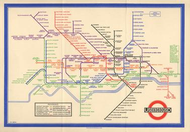
LONDON UNDERGROUND MAP:


The geographical route guide designed by F. H. Stingemore. It was in use from about 1919 until replaced by Beck’s diagram in 1933. 


There were two radical concepts present in Becks design, which have been incorporated in all subsequent versions of the diagram, right up to the present day. They were:
(a) the enlargement of the central area of the underground system in relation to the outlying areas, so that the complicated connexions at the centre could be more clearly shown.
(b) the limiting of the direction
of route lines to verticals, horizontals, and 45° diagonals. This abandonment of geographical accuracy was a revolutionary idea. 


LANCE WYMAN


The starting point was the mandatory five-ring logo that identifies the modern Olympic Games. It was the realisation that the geometry of the five rings could be expanded to generate the number ’68’, the year of the games and with the addition of the word ‘Mexico’ the logotype was created.
 
Mexico 68 clearly identifies the country, the year and the event. The distinct geometric forms suggest early Mexican cultures and Mexican folk-art, and the final design references 1960’s Op Art.


Friday, 18 November 2016

Jo Blaker


Guest speaker Jo Blaker discussed her sketchbook work with us and gave her advice and way of thinking within her own practice. She thinks a lot about who the audience is and where it will work when presented or in use. The content put into her sketchbook is based on collecting and gathering, looking/noticing/observing. Jo thinks about the form and texture, especially the natural forms within things. Sketchbook work is a form of thinking, as soon as she starts making it becomes then another new form of thinking. She suggested if you become bored with what you are doing then try using a new material, her practise is based on play and the sketchbooks help her to do that. Jo recently became interested in nature writing and people's connection with nature and the environment. The content of the image isn't always known when starting it, it can develop throughout experimentations.

From Jo's talk, I have learnt that I need to do a lot more work within my sketchbooks and that it is okay to be a lot more fluid and experimental within them it does not always have to be perfect. I have taken away from the talk that I need to love my sketchbook more and not be afraid to draw each idea I have, even if it may not be all that perfect. 
Points of reference: Eleanor Taylor/ Bigheads(youtube channel)/ Drawing on the right side of the bran and making great illustrations, both books