Saturday, 29 October 2016

Rationales and Group Critique

Baskerville’s goal was to design the ‘perfect’ letterform. It is the typeface with the most precise geometric proportions and the greatest elegance, going back to the style of handwriting. The typeface is mostly known for it’s crisp edges, high contrast and generous proportions. Baskerville is a transitional serif and the designs are based on thinner hairline strokes and delicate tapering serifs. It’s an elegant book face and can excel in purely typographic compositions, Baskerville challenged the typical printing methods in his book design and avoided using symbols and embellishments.

Rationales

1.     Baskerville is a transitional serif and the designs are based on thinner hairline strokes and delicate tapering serifs. However, I am going to challenge these techniques and Baskerville’s idea of a ‘perfect’ font by having no equal spacing between the ascender and decender- with perhaps no contrast with the thick and think strokes which means it would become more un-bracketed.
2.     Baskerville is the typeface with the most precise geometric proportions and the greatest elegance; it goes back to the style of handwriting. But if this was changed and the typeface became humanistic the font should become more contemporary and less ‘perfect’.

Questions I asked for group critique:
1.     Is the word contemporary or inexact more suited and why?
2.     Will the idea of un-equal ascenders and descenders make the font look messy?
3.     Will the humanistic idea draw away from the font too much?

From the feedback I got, I found that the majority preferred contemporary rather than inexact because there has been a revival of the handwriting style typeface and the idea of it being 'less perfect'.

Rationale 1 is much wider preferred over the second as turning the typeface humanistic might make it more old fashioned and draw away from 'contemporary'. Making the typeface seem more hand-drawn is a popular idea if there was a 'contemporary' spin on it but also the idea of changing the ascenders and descenders seems appropriate to experiment with.
Thursday, 27 October 2016

Research into typefaces


Univers


Univers is a realist sans-serif typeface designed by Adrian Frutiger in 1954. It is classed as a neo-grotesq typeface based on the 1898 typeface, Akzidenz-Grotesk. It is part of a group of sans-serif typefaces released in 1957 that includes Helvetica therefore sometimes the faces get confused with one another due to their predominant use in the Swiss Graphic Design style. Univers is a highly influential typeface and is one of the first to fulfil the idea they should form a family of consistent and familiar designs. These different variations are of weights and designated by the use of numbers rather than names- which is a system since adopted by Frutiger for other type designs. It currently has 44 faces with 16 uniquely numbered weight, width and position combinations. Univers is a typeface with many known uses for corporate branding, signage, maps and electronic devises. Apple used to use the font on the laptop keys before changing to VAG Rounded in 2007. It was also used for George W. Bush's campaign logos in 2000 and 2004.

Caslon


Caslon was designed in 1722 by William Caslon and was heavily used by the British empire in the early 18th century. The font is considered the first English typeface and from 1725 to 1730 there were 3 books printed by William Bower using roman and italic fonts cut by Caslon. The fonts were popular throughout the British Empire especially the American Colonies where they acquired their distinctive appearance from the exposure to salt air during the voyage from Britain. The use of the font decreased upon his death but was revived during the British Arts and Crafts movement of the 1840's to 80's. It is now considered the standard for typesetters and printers and is widely used. Caslon himself never designed a bold font but through the beginning of the 20th Century there has been 3 changes in the technology of typesetting that affected the Caslon font. Firstly the introduction of hot type and the development of photo setting in the 60's and 70's. This then developed to digital fonts that began in the 1980's. There have been many re-designs of the font, some far from the original. It has been used to set both the Declaration of Independence and the U.S. Constitution and the title font for the play Les Miserables.

Baskerville


Baskerville was designed in 1754 by John Baskerville and is mostly known for its crisp edges, high contrast and generous proportions. Baskerville was illiterate but his interest in calligraphy and practised handwriting inspired him to learn how to read and write, these interests are evident in the strokes and embellishments within his printed typeface. The font is classes as a transitional typeface in-between classical typefaces and the high contrast modern typefaces. Baskerville developed his own method of working which resulted in woven paper and darker inks, creating an intense black ink colour through boiling fine linseed oil to a certain thickness. Baskerville would follow other printers closely which resulted in the highest standards for presses altogether. The font had little success during his life but his widow sold the Baskerville punches and matrixes to France where it circulated among foundries. American typographer, Bruce Rogers discovered a Baskerville type specimen in a Cambridge bookstore in 1917 and the type was revived in the 20th Century when he became a printing adviser to Harvard University Press. The font is an elegant book face and it can excel in purely typographic compositions and today remains one of the most popular and classic typefaces for print due to its legibility and refined beauty. 

Clarendon 


Clarendon was created in 1845 by Robert Besley for the Fann Street Foundary- it is named after Oxford's Clarendon Press and is a popular slab-serif. The letterforms represented a significant change from the slab-serif Antiques and Egyptians that were so popular in that time. The typeface became popular which lead Besley to register the design under Britain's Ornamental Designs Act of 1842 but the patent expired 3 years later and many competing foundries quickly copied its design once the hold was released. 
Besley's reaction

Clarendon is considered the first to design 'bold', seen in Besley's response in the above image, which meant this technique was quickly caught on by other designers. There were many variations of the typeface which are still being created today. In 1935, it was released by Monotype into it's modern incarnation by Hermann Eidenbenz. It remains today a popular choice for many logotypes including Sony and Starbucks. 

Berthold

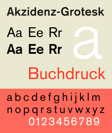
The H. Berthold typefoundry was created in 1858 by Hermann Berthold. It was renowned for crafting high-quality typefaces and by 1918 the foundary had become the largest in the world. After World War II, Berthold developed his own typesetting equipment and in the 1950's he unveiled his first phototypesetting machine, the 'Diatype'. He then introduced the 'Diatronic' in the 60's, this was the first keyboard controlled phototypesetting for volume production. During the 20th Century, the typefoundry developed the Berthold Exklusiv Collection- a collection of typefaces created solely for Berthold by distinguished designers. The foundry's most celebrated typeface family is Akzidenz- Grotesk, created in 1896- it is an early sans-serif which prefigured by half a century the release of popular neo-grotesque typefaces like Helvetica. In 1950, type designer Gunter Gerhard Lange became part of the company and he designed various original typefaces like Concorde and Imago. He also oversaw the foundry's revivals of classic faces such as Garamond, Caslon, Baskerville and Bodoni.


Sunday, 23 October 2016

Logotype- Final 5


1.     1) This logotype is the one I think works best for the type of company I want to create. I decided to use the technique of ‘drop-cap’, which means the first letter of the word is a larger capital font compared to the rest of it- this technique is used in many books and magazines therefore I deemed it appropriate for my logo to link a technique of printing text in a book to a book store logo. The kerning between the lettering is varied as the spacing between the capital ‘d’ and the rest of the word has been pushed closer together- this gives me the imagery of poetry which to me emphasises the established and sophisticated feel I intend the brand to have. The height of the lettering is the smallest compared to the other 4, this is because the word ‘diddle’ has connotations of small and confined compared to tall and extravagant letters. Furthermore, when applied in context the technique of drop-cap should become more recognisable to the audience as they should make the connection from books they have read to the logotype of the bookstore. The logotype also reiterates the feedback I received on my designs as the closer together kerning was a lot more favored due to the idea of being in your own little bubble when inside a bookstore.

2.   2) This logotype design has a very simplistic look to it, this is due to the tall type and very spaced out kerning. The letters have been extended to be taller compared to the original type, all with equal spacing between each one. This logotype is easy to read leaving no difficulty in distinguishing which letter is what. However I don’t think these would be as appropriate and effective when put into context compared to the previous design due to them not being as compact and close together- the logotype may come across as more child-like, which is the opposite to my target audience.

3.   3) This design is simply the Garamond font with no alterations to the actual letters. There is just a slight alteration to the kerning of the letters meaning they are more spread apart which works nicely whilst they are in capital letters as the letters can be easily read- it can be difficult for the two capital d’s to be read next to each other. The tall and capital lettering appeals to the target audience and creates an established and professional feel to the logotype therefore would work when put into context.

4.   4) The drop-cap technique is used again on this design but the capital d and the rest of the letters have a more even spaced kerning between them and the letters are a lot taller. This creates a different feel to the logotype and creates the imagery of more a fairytale rather than an established piece of literature. The rest of the word is moved up from the baseline, which breaks the conventional rules of type and something you may find on a typical bookstore logo, separating it from the existing stores.

5.    5) The final design draws on the idea of the full stop at the end of the word as the ‘d’ at the start represents half of a full stop and by the time you get to the end you have a full stop therefore the experience of being in the bookstore is completed or the book you are reading is completed. The logotype is in full capital letters and have not been extended so there is a contrast of tall and short letter shapes with them being extended of the baseline to create a more interesting logotype.


Logotype- Responses to group and class critique

Using the points and ideas I got feedback for from the group critique these are the responses drawing from what was said about the initial ideas. The most obvious thing that makes these designs different is the addition of the full stops and commas, this simple alteration has improved the design greatly and gives it a lot more personality and meaning as a logotype for a bookstore. I started to experiment with the use of drop-cap, however I think the spacing between the letters could be improved but I do not think this will be achieved by hand so producing sketches may work better.


These are the hand drawn traced designs I have experimented with, it is clear the drop-cap works very well and I am able to see if even spaced or close together kerning is most successful. The designs that are not even on the baseline create an engaging logo type for a book shop and would be interesting to take forward. 

Saturday, 22 October 2016

Milton Keynes Gallery Re-Brand

Screenshot from MK gallery website
In 2011, Sara De Bondt re-branded and re-designed the Milton Keynes Gallery. She needed to create an identity without using a specific colour pallet; typeface or logo therefore took to the identity of Milton Keynes and found a strong connection to grids and structure. The designs are based on an aerial view of Milton Keynes, which instantly enables a strong connection between the public and the town. Allowing them to associate their identity with themselves and the town to the identity of the gallery instead of being fixed to a logo or a particular type or colour scheme. This engages the gallery more to the people in the town who are not perhaps into art but can connect with the aesthetics and history of the building, proving that this still works with all the typical elements taken away. De Bondt has created a clever identity without relying on the conventional rules of design and marking the gallery with a logo that is featured on everything whereas the identity is more fluid and a range of design, colour and font is used.

“Speaking of the design, Anthony Spira, MK Gallery Director said: These large-scale, bold, colourful designs, are intended to make our building more visible and arouse people’s curiosity about the lively and exciting programme being presented inside our building.

SaveSave

Friday, 21 October 2016

Helvetica


  • Helvetica was created in 1957 during the emergence of Swiss style in the 1950's. There was a feeling of idealism that design is partial to rebuild and be more democratic. This means it has a sense of social mobility giving it power and hierarchy above other typefaces. Helvetica is clear, readable and straightforward therefore it became incredibly popular for signs and corporate systems, it is even used for the IRS tax forms.
  • Massimo Vignelli created New York City's transit signage. He has an extremely positive view on the typeface and believes type should not be expressive because without helvetica we are surrounded by "visual disease." He says type is like music, it is not about the notes but more about the spacing in the notes.
  • Although Helvetica is such a popular typeface, not everyone agrees that it should be used. Erik Spiekerman states that real type needs rhythm and contrast, however Helvetica does not. He says it is a default font that is never going to go away which means it becomes repetitive and boring. He says helvetica has a human like quality to it which is positive in communicating to the wider audience yet not to Spiekerman as he thinks the aim of type design is to look familiar.
  • Design writer, Rick Poynor calls helvetica the law of diminishing returns, meaning the more the public see it then the more the designer uses it. This ultimately makes the typeface incredibly familiar and predictable. By the 70's there was a huge reaction against the conformity of the "dull blanket of same-ism" that helvetica created. This specific way of design is imposing on the world and something that came out of idealism by this time became routine and there was a huge need for change.
  • Despite the split views of helvetica, it is universal which means it is used everywhere. It is the ultimate typeface because it is available in so many platforms, giving it a feeling of finality, it is the typeface that says everything yet why is it so popular? The fact it is everywhere makes it arguably the "safe" option.
American Airlines logo
The American Airlines logo was created in 1966 by Massimo Vignelli. The first thing you notice about this logo is the obvious use of colour, Vignelli said "what could be more American than red and blue" and he is right in saying this as the colour is the most obvious thing about the logo. I don't think there is much more to the colour than the fact he used red and blue to represent the American flag, this reiterates what Vignelli said about it being typically American. Typically to his work, the font used is helvetica which gives the logo a clean and formal look to it as he was very keen on the concept of modernism. Vignelli only uses at most 3 typefaces with helvetica being his most used in many of his logo designs, the font used creates a neutral and transparent effect to it. The designer is trying to communicate America as a country and their proudness of the airline being established and efficient.  

American Apparel logo
The American Apparel logo is arguably very similar to the American Airlines logo, despite the fact they are both in Helvetica font the kerning is also very similar, the American Apparel logo is slightly closer together and there is a bigger gap between the two words. Therefore, there is a lot more negative space around the logo meaning white is a very predominant colour as well as the bold black font giving a high impact when the logo is placed into context. I do not find this logo very engaging, however the simple no fuss means it has become instantly recognisable and iconic, the close kerning on the logo means it can be easily applied in context to numerous platforms and it still work just as well. 
Muji logo

The Muji logo is a bit more different to the other two logos, they are different to many other logos because it is distinguished by its design minimalism and no logo or brand policy. This reflects through its logo as they have chosen to use helvetica as their typeface, helvetica can be viewed as a minimalistic font which is what the company is recognised by. They do not put much money into their branding and designing so they intend for their logo to be simple which allows more emphasis on the brand itself and I think that is what the designer of the logo is trying to communicate. The designer has approached the design of the logo in this way to reflect the brands identity and not draw away from what they believe in.


Tuesday, 18 October 2016

Logotype

These are my initial designs and ideas for the Logotype, I have just started off by experimenting with the regular, bold and italic style font to try and see which works the best for the logo. It is important to keep in mind the target audience and type of company the logotype is for, for example immediately the italic font does not work for the established and sophisticated type of book shop I am creating and it would not work in context on the shop sign or website. The font in capitals is also quite difficult to read, especially with there being 3 d's within the word and if the kerning is very close together it again makes the word look confusing to read. I think the most successful designs are the ones in the regular font style- the bold font looks too harsh for the style of company, whereas the regular style has a more softer and established look to it.

Figure 1


Critique feedback:
  • Try putting a full stop or comma at the end of the word to resemble the meaning off the word- passing time aimlessly. The full stop would show the stopping of time to relax and read a book, the comma, pausing for a break to read  a book. 
  • Experiment more with the kerning- try the logotype looking more informal.
  • Perhaps look into concrete poetry.
  • Try experimenting with the weight of the type.


Sunday, 16 October 2016

Logotype- Initial Research

Brief:

Produce a series of logotypes for a rebrand of your given company. Using only type, experiment with scale, stroke, spacing, contrast and alignment to interpret your company. You should consider the following:

Who is the company?
What do they do?
Who is the target audience?
Where will the logo appear?

Initial Research


"Out of thousands of typefaces, all we need are a few basic ones, and trash the rest."
- Vignelli's 6 basic typefaces.

The typefaces he chose were the best are: Garamond; Bodoni; Century; Futura; Helvetica and Times New Roman. 


Research into chosen font Garamond

The word I was given to turn into a company was 'Diddle', when I looked into the meaning of the word a few came up.
- 'To steal money from someone by cheating'
- 'To spend time doing something or handling something in an aimless way'
- 'To totter as a child walking'
- 'Pass time aimlessly or unproductively'
- 'Deliberately falsify'
- 'To cheat or swindle someone so as to deprive them of something'

My first thoughts of companies from looking at this definition were casinos and loan shops, based on the idea of cheating someone or depriving them of money. However, they would not make very appealing company names if the consumer knew what the word meant, they would also be very un-interesting from my perspective to look into and produce research and outcomes as I do not know much about these type of companies. Therefore, I thought more about the definition 'pass time aimlessly or unproductively' and thought of companies like bars, cafes, book shops and record stores as these were a nicer more sensitive approach to the word definition. I have chosen to go with a book shop as the idea of passing time aimlessly, which then creates a relaxed environment, enabling you to pass time without feeling guilty. Book shops can be very formal and sophisticated, so I am going to target this book shop at ages around 30-60. 

I have chosen to use the font Garamond for my logotype firstly because it is described as the 'typeface that lives on paper', it is also used in every Harry Potter book making it the perfect font for a bookshop. Secondly, Garamond is a serif font which automatically gives it a formal and well established feel to it as I want the book shop to give off the impression it has been around for a long time but also the idea you need to stop what you are doing and let time pass perhaps unproductively. 


First hand research of existing bookshops around Leeds- showing examples of how their logos are shown on shopfronts and signs.


Saturday, 15 October 2016

Ligature Task- Final Design


The experimentation of the ligature just using two letters is working out a lot better and the word can still be recognised as its abbreviation. The bold font is effective in getting across the aggression and frustration of the ligatures meaning, the fact it is also two letters means it will be easier to be placed on a keyboard key or mobile phone button. 

Final Ligature Design
This is the design I have chosen to be my final ligature, I think this is my most successful variation because the two letters have joined to become connected, exactly what a ligature is. I could see this symbol on a keyboard key or on a mobile phone as it is something that would be used a lot by people. The connection of the two letters allows the ligature to be recognised for what it is, the symbol looks as though it could become an iconic ligature used by many to express frustration on a text.


Ligature Task


BRIEF:
Design and develop a new character for a typeface of your choice.
The new character should be designed as a response to a pre-identified problem
Explore the use of negative space, silhouettes, angles and shape. Explore the use of abstract and representational forms.
Characters within a typeface should work effectively on a range of scales from large to small.
To an extent typefaces are international, there are no language barriers. 
What is a Ligature?
Two or more letters joined together to form one character. In typography some ligatures represent specific sounds or words such as the AE. Others are used nearly to make type more attractive and they are usually only available in extended character sets. 
FFS: For F***'S Sake

(Turn this modern day slang into a ligature that could be added as a keyboard key on a laptop or button on a mobile phone.
Figure 1
In figure 1, I have just simply experimented with the size of the font, using Helvetica because the bold version creates a very stern, almost aggressive feel to the ligature. I think the bold works best compared to the regular and italic because the slag uses an expletive therefore the use of a bold font emphasises the frustration when the word is used.

Figure 2

Figure two again shows experimentation of turning this into a ligature, I have experimented with the kerning of the word to see if it woks better closer together or further apart. The ligatures that are closer together in my opinion are working best as they are more succinct. I think shortening the ligature to just two letters may work best because the word can still be read as it original meaning.


Monday, 10 October 2016

Kerning Task

The impact of kerning on a brand is important as the logo typeface becomes the brand identity therefore has to appeal to the target audience, informing the consumer of the brands identity.

TASK: Using 4 letters, two uppercase and two lowercase, arrange them in a way to fit an identity of a particular type of brand.

1) Luxury car brand
Figure 1
Our group decided that a luxury car brands logo should be evenly spaced and quite close together to fit the back of a car without it looking squashed. For a luxury company the logo would be neat and straight to highlight the luxury and wealth for the consumer when purchasing the car.

2) Budget supermarket
Figure 2

Looking at existing budget supermarkets, we saw they're usually short and simple so we took away a letter and just kept the letters very basic and evenly spaced. Budget supermarkets have become very competitive so keeping the logo very simple and 'cheap' looking will instantly inform the customer that it is affordable.

3) Condom company 
Figure 3
The key ideas for this logo was to create something playful so the letters are on a slant and don't follow a straight line. They are also closer together than the previous to maintain the playful and friendly image of the condom brand. It is also important to keep the logo safe and trustworthy looking which the consumer will also be looking for when purchasing the product.

4) Indie band
Figure 4
This needed to be very quirky and different as that is the image indie bands wish to give out to their listeners therefore our group decided the letters should be alternate capitals and lowercase, with the lowercase underneath the capitals. The logo type is also quite playful and not to a strict grig system yet we kept them evenly spaced so there was still some kind of structure to the logo.

5) IT company
Figure 5
Two capital letters to show the companies seriousness and uniformity. They exist to connect people hence why the letters have quite close kerning but not touching- this highlights the companies connectivity without it being too playful and informal.